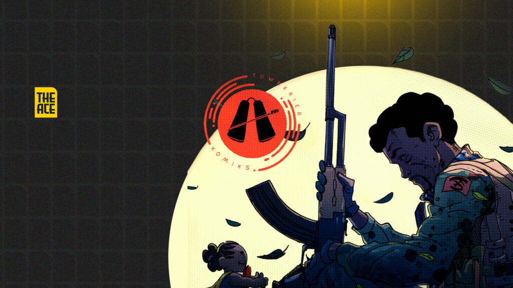
Some comics announce themselves through spectacle. They open with explosive splash pages, elaborate action choreography and cinematic excess, immediately signalling their ambitions. Yakubu by Townkrier Comics chooses a different route. It is a comic that finds its confidence in restraint. Rather than asking the artwork to constantly entertain, it asks it to observe, to linger, to sit with grief, and to allow memory to become as tangible as any physical landscape.
Yakubu unfolds as a personal story rooted in loss, family and the long psychological shadow cast by violence. Its visual language is guided by an equally compelling philosophy. Every page appears designed around emotional rhythm rather than dramatic flourish. This is the comic’s defining artistic characteristic. It understands that sequential art is as much about controlling time as it is about drawing figures, and throughout its pages the artists demonstrate a willingness to slow the reader down.
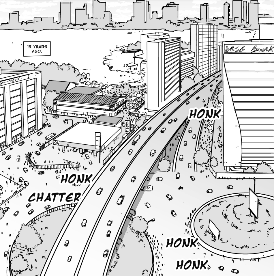
That rhythm is established almost immediately. The opening aerial view of the city on page 5 does more than orient the reader geographically; it introduces a sense of emotional distance that permeates the rest of the comic. From this detached perspective, the narrative gradually descends into intimate spaces like homes, hospital rooms and conversations between loved ones, mirroring Yakubu’s own movement from public existence into deeply personal memory. It is a transition that feels less like changing locations and more a narrowing of the emotional focus that establishes the comic’s visual priorities.
The opening pages are effective despite the layouts rarely abandoning conventional grids or varying their structure. The consistency creates a steady reading cadence that complements the reflective nature of the story. Rectangular panels dominate much of the book, allowing conversations to unfold with an almost cinematic patience. Rather than fragmenting exchanges into dozens of dramatic close-ups, the artists frequently allow scenes to breathe within comfortably proportioned panels, trusting performance rather than composition to carry the emotional burden.
Drawing Silence
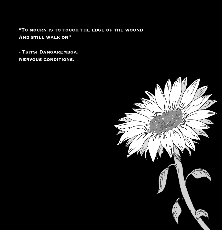
This discipline becomes even more apparent through the comic’s recurring sunflower interludes. Appearing after emotionally significant narrative turns in the reflective spreads around pages 4, 21 and 42, these pages function less as decorative chapter breaks than as visual punctuation. Against stark black backgrounds and accompanied by carefully selected quotations, the sunflower emerges as a recurring motif that transforms the simple act of turning a page into a moment of contemplation. Instead of rushing towards the next revelation, the comic briefly suspends narrative momentum, inviting reflection before continuing. It is a literary device in sequential art, one that gives Yakubu a rhythm more commonly associated with prose fiction than mainstream comics.
The artwork’s cinematography demonstrates a similar confidence. Wide establishing shots are used sparingly to introduce environments before allowing the camera to settle into medium and close framing, where emotional nuance is allowed to flourish. The comic rarely resorts to exaggerated perspectives or dramatic Dutch angles to manufacture tension. Instead, it places its faith in carefully observed human interaction. Much of the visual storytelling unfolds through conversations, glances and hesitation rather than physical movement, and the framing consistently reinforces this intention.
One effective sequence arrives during the “one month ago” scenes beginning on page 22. Rather than treating the setting as merely functional, the artists repeatedly narrow the frame around Yakubu’s face while allowing the surrounding environment to fall away. By page 24, panel 2, silence has become the dominant storytelling device. The emotional weight comes not from what is spoken, but from the pause between one panel and the next, where the reader is invited to inhabit the same uncertainty as the protagonist.
Close-ups become particularly significant during moments of emotional vulnerability. Faces are rarely exaggerated, yet they communicate remarkably well through subtle shifts in expression. A lowered gaze, tightened lips or slight tension around the eyes often conveys more than the dialogue itself. The artists appear to understand that emotional realism depends less on theatrical facial distortion than on controlled restraint, allowing readers to project their own feelings into the silence between words.
That same sensitivity extends to the handling of body language. Characters rarely stand as static figures delivering dialogue. They lean against walls, avoid direct eye contact, fold their arms, hesitate before speaking or subtly withdraw from one another. These gestures appear ordinary in isolation, but collectively they create believable human performances. It is this attention to physical acting that gives many conversations their emotional credibility. Even when the dialogue becomes exposition-heavy, the figures continue telling their own parallel story through posture and movement.
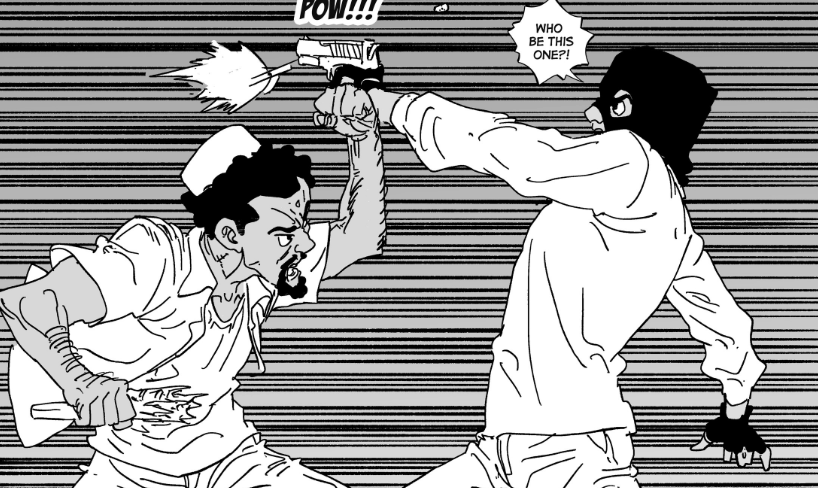
The confrontation that unfolds across pages 30 to 34 is perhaps the comic’s finest demonstration of this principle. Rather than escalating through gradual dynamic action, the sequence relies on tightening compositions, measured reaction shots and carefully controlled pacing. By the time the violence finally erupts, the reader has already experienced the emotional fracture through posture, framing and silence. It is an excellent reminder that tension in comics can be created through anticipation rather than impact.
Places That Remember
Environmental design also deserves recognition for the way it reinforces the narrative. Urban streets, residential compounds and interior spaces are rendered with enough specificity to feel inhabited without becoming excessively detailed. The backgrounds never compete for attention, but neither do they disappear into generic abstraction. Instead, they provide a constant reminder that these characters exist within a tangible social reality. Architecture, furniture and public spaces all contribute to a convincing sense of place.
Perhaps the most impressive aspect of the draftsmanship is its understanding of visual hierarchy. The comic is rendered almost entirely in monochrome, but it consistently directs the reader’s attention through thoughtful management of value and contrast. Foreground figures are frequently separated from their surroundings through carefully placed areas of black, while simplified backgrounds prevent unnecessary visual competition. This economy of rendering allows the eye to move naturally across each page without becoming overwhelmed by excessive texture or detail.
Where the artwork occasionally becomes less assured is during longer dialogue sequences. Although the storytelling remains consistently clear, there are moments when consecutive panels employ very similar framing and scale, causing conversations to feel visually static. The emotional performances carry these scenes. However, more variation in composition, perhaps through more adventurous use of negative space or more deliberate shifts in camera distance, could have intensified the dramatic rhythm without compromising the comic’s restrained identity. It is less a weakness than an opportunity for greater visual sophistication.
The linework itself reflects a similar philosophy of moderation. Rather than pursuing hyper-detailed rendering, the artists favour clean contours supported by selective texturing. Clothing folds, vegetation and architectural surfaces receive enough information to establish material qualities without burdening the page with unnecessary complexity. The result is artwork that remains highly legible throughout, particularly during dialogue-heavy passages where excessive rendering might otherwise compete with the lettering.
Lettering integration further reinforces this clarity. Speech balloons are positioned with careful consideration for reading flow, rarely obscuring important visual information or disrupting panel composition. The reader’s eye moves naturally across each page, assisted not only by balloon placement but also by environmental cues such as roads, architectural lines and character gaze. It is evidence of a production team that understands sequential storytelling as a holistic process rather than a collection of isolated artistic decisions.
When Restraint Becomes the Style
Perhaps the most compelling quality of Yakubu lies beyond any individual technical achievement. The comic consistently resists the temptation to dramatise emotion through visual excess. It understands that stories about grief, memory and inherited trauma are more powerful when observed quietly. Instead of treating every emotional moment as a climax, it allows feelings to accumulate gradually across pages until their weight becomes almost imperceptible. By the time the narrative reaches its final movements, the reader is carrying that emotional accumulation almost unconsciously.
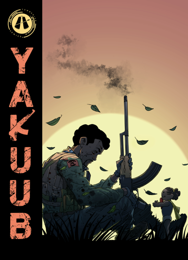
This restraint ultimately becomes the comic’s defining aesthetic. The artists are less interested in demonstrating what they can draw than in demonstrating what the story requires. That distinction is significant. Too often, independent comics mistake technical virtuosity for visual storytelling. Yakubu avoids that trap by allowing composition, pacing and performance to serve the emotional architecture of the narrative rather than drawing attention to themselves.
There remains room for further refinement. Greater compositional experimentation during extended conversations, stronger foreground separation through more assertive line-weight hierarchy, and a more expansive use of recurring visual symbolism could elevate an already accomplished work into something even more formally distinctive. Nonetheless, these observations arise precisely because the comic already demonstrates such a confident grasp of sequential storytelling fundamentals.
Ultimately, Yakubu succeeds not because it attempts to redefine the language of comics, but because it speaks that language with uncommon sincerity. It understands that the most affecting stories are often those that trust readers to sit with silence, inhabit memory and discover meaning within the ordinary. In a spectacle-driven comics landscape, that quiet confidence becomes not merely an artistic choice but the work’s greatest strength.
AI Use at TheACE
TheACE uses artificial intelligence tools to support research, drafting and analysis across Africa's creative industries. All content is verified, edited and approved by our human editorial team to ensure accuracy, clarity and responsible storytelling. AI assists our work; it does not replace human judgment.